SaferRing
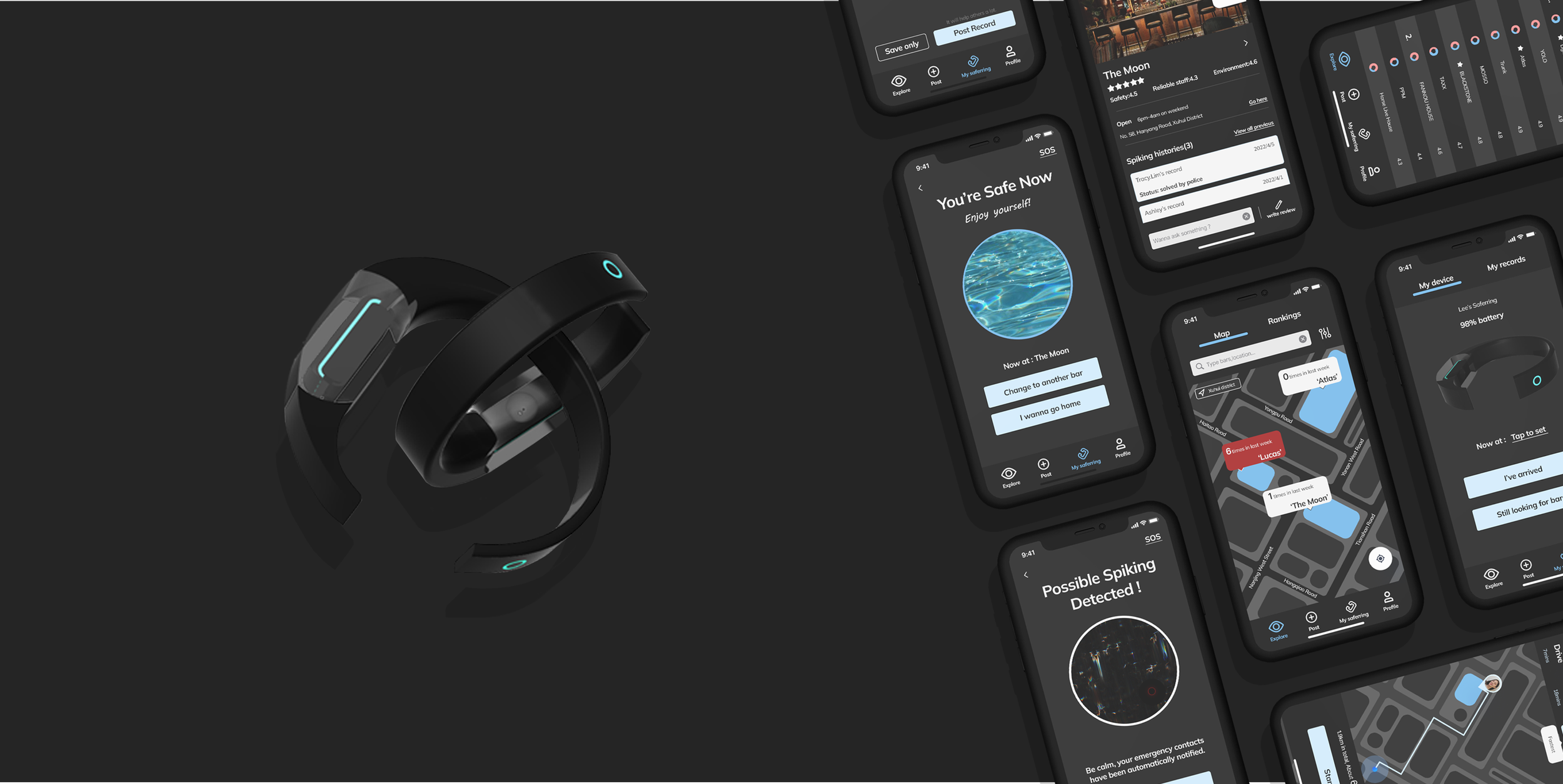
An app+device design that helps people find safer bars as well as protects them from drink spiking.
Project Overview
The Problem
It’s hard to know whether a bar is safe or not, and hard to protect themselves from being spiked.
The Objective
A portable smart device to test drink spiking, and an app connected with it to share metadata.
Role
Design Research, UX & UI Design, Visual Design
Background Research
1. About drink spiking
2. About users
01. Define users
02. Personas
03. User journey map
1. About drink spiking
My design began from a news of drink spiking surge in Shanghai where some of my friends lived in, then I started to analyse drink spiking and found that it is a worldwide rampant problem especially for vulnerable groups. The following data is from Alcohol.org:
Drink spiking are more rampant than you think, especially for vulnerable groups
1. Rampant
According to the research, Over 20% of the nearly 1,000 respondents have experienced drink spiking.
2. Low reporting rate
Over half of the victims didn't report to authorities.
3. Gender & age vulnerability
Women are 5 times more likely to be spiked than men. Most drink spiking happen when victims are around 20.
It’s challenging for people to notice drink spiking and well protect themselves
1. Hard to notice
Common spiking drugs like GHB and Ketamine,etc, they’re colorless, odorless, tasteless.
2. Unconsciousness & memory loss
These drugs will take away both the victim's ability to fight back and memory. Alcohol tend to make the situation worse.
3. Hard to test
These drugs leave victim’s body quickly, they will not show up in the results unless the victim tests immediately and correctly.
Key
Findings
It's difficult for people to protect themselves in bars from drink spiking and there's lack of trusted ways to report issues and share information with others.
2. Main users: Young females in bars
01. Define users
Based on the research above, I identified the main users as young women. After interviewing potential users, I selected the following 4 representative respondents to understand the needs and pain points of users.
I defined my target users as two groups based on their characteristics and main demands: People in bars, and others who care about them. Then I separately concluded pain points from their user journeys and emotion flows.
02. Personas
03. User journey map
Main Pain
Points
Define & Ideation
1. Define the design challenges
2. Competitor analysis
3. Idea brainstorming
5. Wireframes & User testings
4. Information architecture
6. Hifi design & Final delivery
1. Define the design challenges
I narrow down to 3 user problems based on my survey above. After that, I integrated them into 2 directions as the start point of the next stage: 2 key design challenges to solve.
Key Design Challenges
#1 Info sharing about bar safety.
#2 Timely alert on drink spiking.
2. Competitor analysis
I conducted a competitor analysis based on the 2 key challenges to help me define product goals.
Key
Summary
1,A device is crucial for instant protection, and an app is a plus for prevention
Users trust physical protection and rely on apps & web to search for information.
2,The device must be portable for practical consideration
In addition, users wish the protection will not directly contact with their beverages.
3,Data share is the key in sharing information
The data that users need is concentrated in fixed places, and its variety is clear, thus enhancing the advantages of the crime map itself.
3. Idea brainstorming
01. Concept
Inspired by these products, I brainstormed different directions to explore a better way to design both safety database and drink spiking protection. I tried to avoid the disadvantages of existing methods and finally I filtered and left two candidate directions for both design challenges.
After the two main parts, I started to focus on timely sync info between users and people who care about them because it’s another key to enable users get timely help.
I interviewed several potential users and their family or friends about 'What are the key messages you want to send/receive in an emergency? ’, as well as investigating some ‘SOS apps’. I finalized these info as followed.
02. Feedback from potential users
I discussed each candidate direction with 4 potential users and invited them to compare these ideas with my competitors such as Pd.id. Here is the summary of the main feedback I got.
User feedback for the database revolved around two different design directions I provided, while for the device it was mostly their thoughts on the form and functions of the device. I categorized based on this difference.
Ideas
Selecting
Crime map with Rankings
Based on the feedback I got, I decided to combine the map idea with a ranking system to make a more convenient safety info database.
A ‘Smart Ring’
For the protective device, I chose the 'Smart Ring' to go on as it is more portable and it will adapt better to different sized cups.
4. Information architecture
Based on the needs of users, I designed the information architecture to guide me to finish the wireframes of interfaces with multiple functions.
5. Wireframes & User testings
I created a wireframe and invited 3 users to do usability testing to made iterations on the whole user flow as well as the interfaces.
Get prepared
Users get to know SaferRing. Briefly learn and bind device for later use.
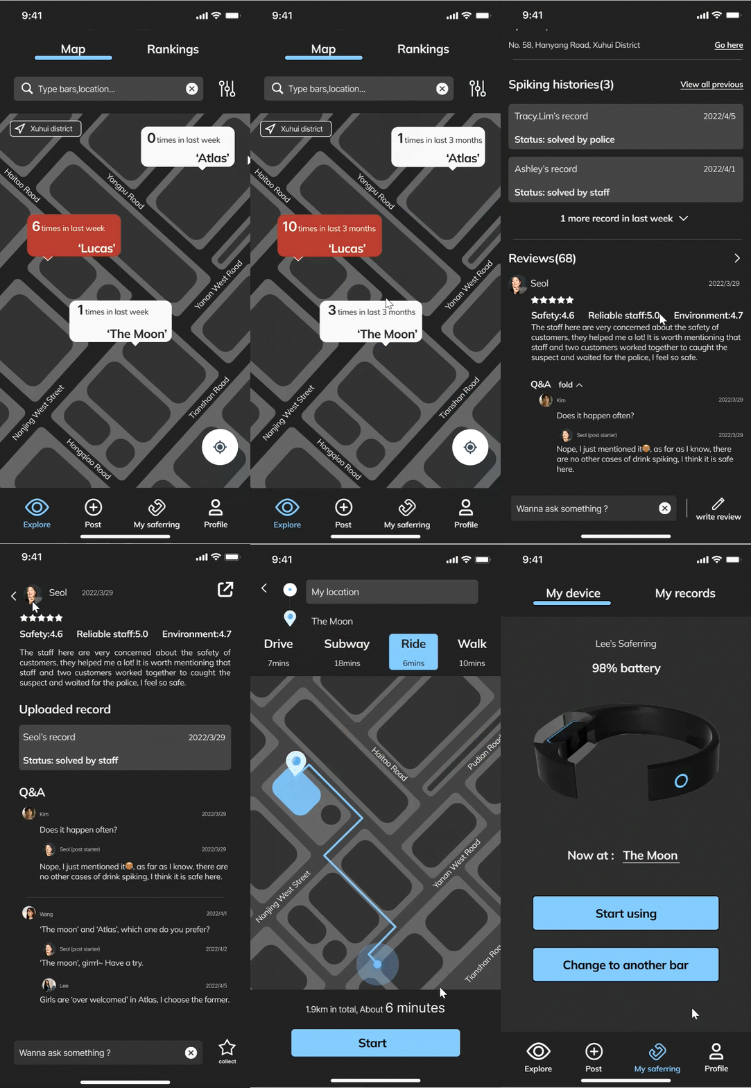
Explore bars & check safety details
Users can view & compare the number of drink spiking happened at different bars, as well as spiking history and others’ reviews.
Recommendation
Users can directly view a ranking of certain safety factors to easily find safer bars based on their own needs.
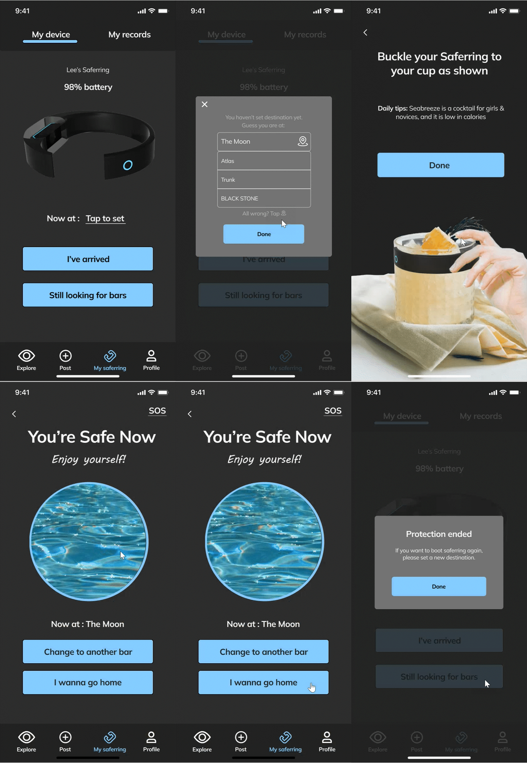
Start auto-protection
Users can check their SaferRing’s status as well as start protection after they arrived at bars. Following the guide, they can buckle their SaferRing on cups and have fun.
They can easily tell whether their drinks are safe or not by SaferRing.
Timely alarm
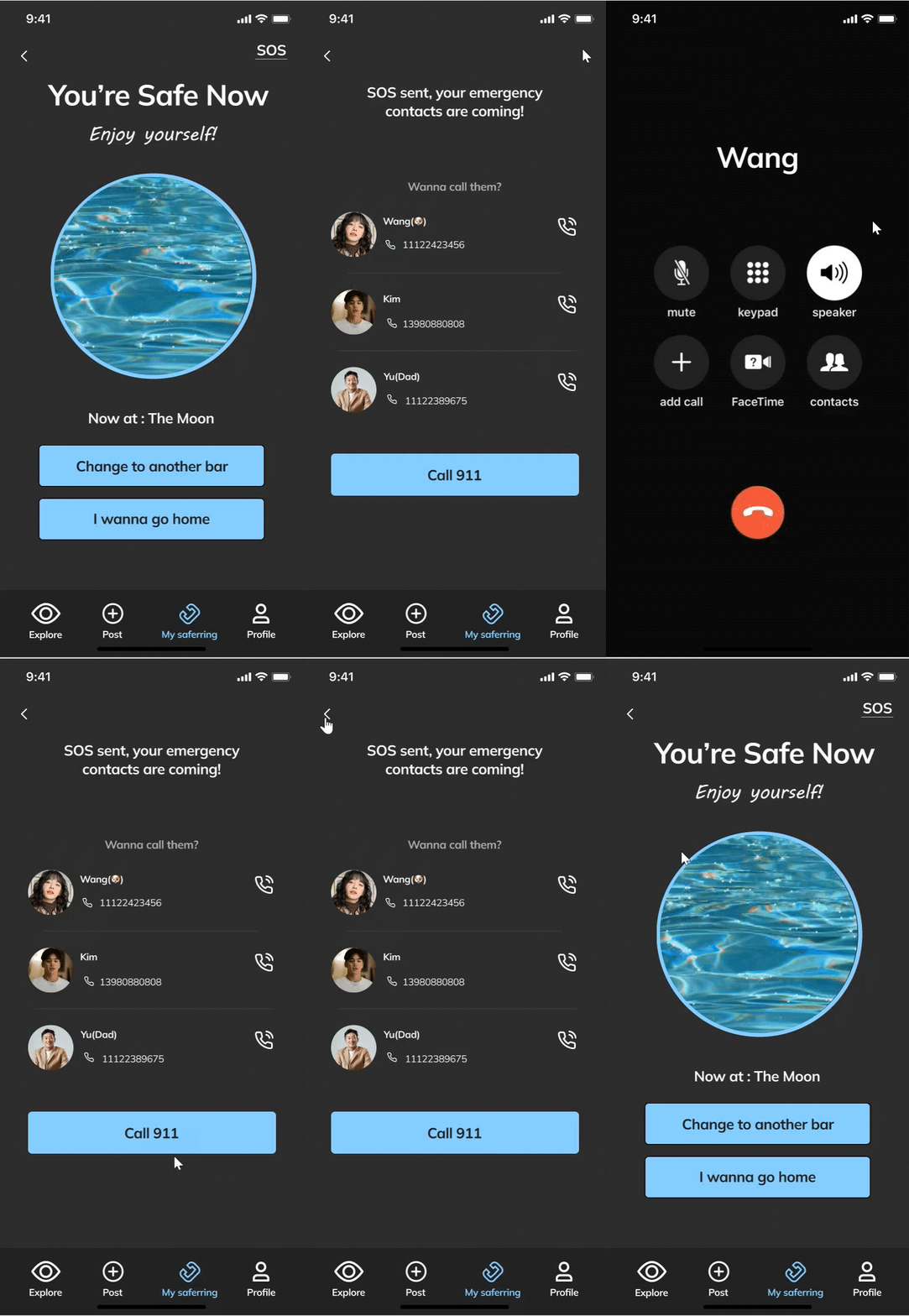
Warn users once SaferRing detects something were added into cups. Possible spiking would be auto-sent to emergency contacts.
Profile & Emergency contacts
Users can edit their personal info & settings about their privacy.
Users can edit and add their emergency contacts who will get their SOS when they are in danger.
Spiking records & posting
All records would be auto-saved for users to view and edit anytime. They can choose to upload the whole process & other details after they think all problems are solved.
These info uploaded would be showed in bars’ profiles for other users to view.
User testings
Iteration 1 : Make onboarding more efficient
Iteration 2 : Provide relevant information
Iteration 3 : Matching with more scenarios, users can use certain functions without limits
Iteration 4 : Make SOS more noticeable
6. Hifi design
Visual design & Design System
Font: Mulish
Mulish provides feeling of urban and technology. It’s suitable for Saferring’s visual branding.
In addition, Mulish is clean to read, and shows more information in less space, which make Mulish suits Saferring better.
Color Scheme: Light blue theme
Dark background & light blue theme are selected to provide a sense of sobering and also align with the key usage scenario.
Also, I tried to provide a high color contrast to increase the readability as well as protect users' eyesight especially when they are in dark environment.
Accessibility Check
Sticker Sheet
Final delivery
SaferRing - Device
I designed it with a streamlined look to make sure it is portable and fits most cups. Considering the use cases of SaferRing, I made it as clear and simple as possible, thus the user just needs to scan it with the app and buckle it on their cups.
SaferRing - App
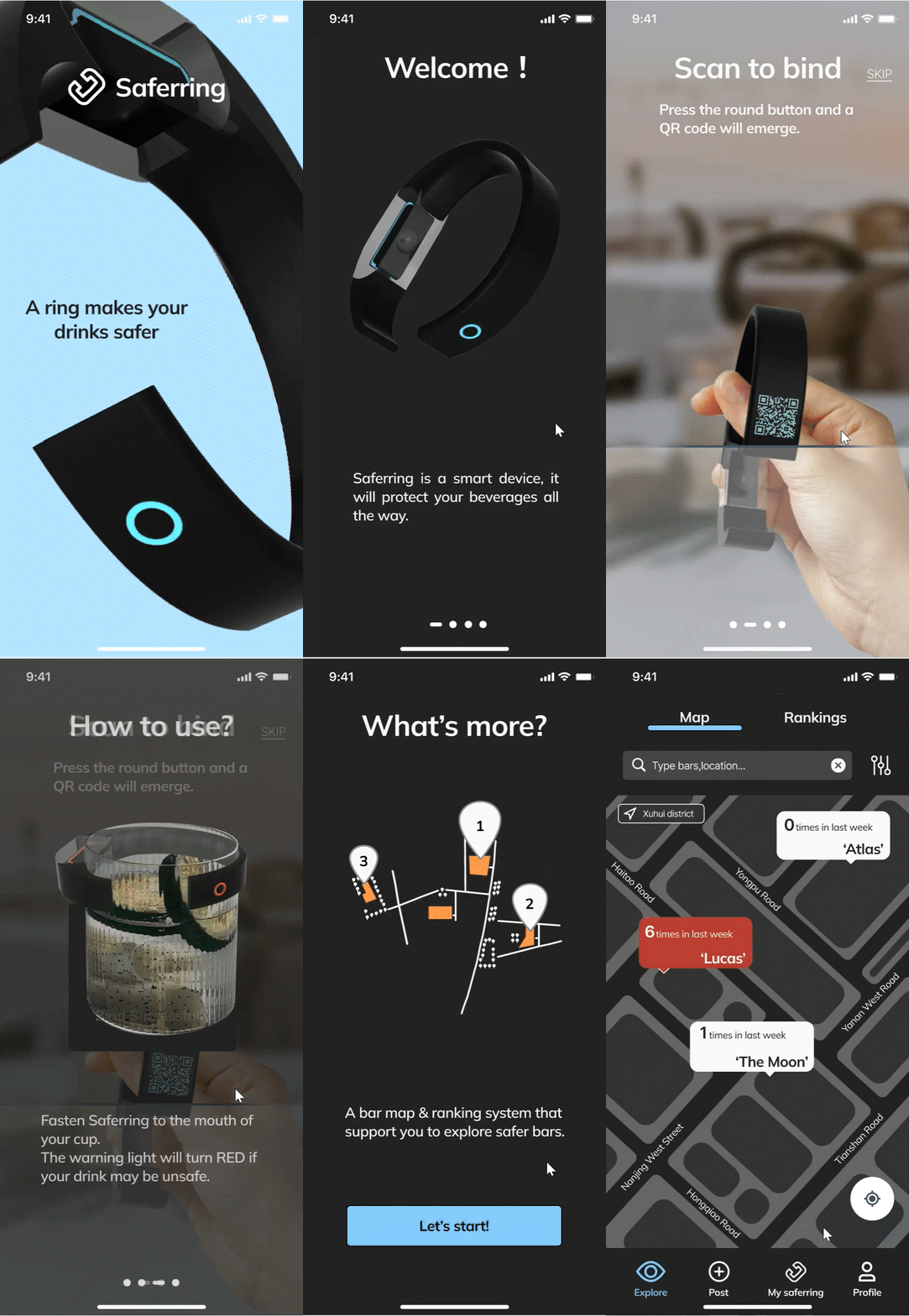
On-Boarding
Step-by-step guidance on key features.
Explore - Map
Digest safety information of bars at a glance.
Fitting design challenge 1 - support users with accessible safety info
Explore - Rankings
Smart filter for users to customize bar search result.
Fitting design challenge 1 - support users with accessible safety info
Protection start
Make changes freely and get location data synced from time to time.
Fitting design challenge 2 - protect users’ drinks throughout
and design challenge 3 - enable users to get noticed at once when they’re in danger
Spiking detected & SOS
Users can easily tell if something are added to their drinks.
SaferRing would Automatically sync info to users' emergency contacts. Users can send SOS anytime.
Fitting design challenge 2 - protect users’ drinks throughout
and design challenge 3 - enable users to get noticed at once when they’re in danger
Manage records & Post
Users can edit and view details of their records.
They can post these records to help others further.
Fitting design challenge 1 - support users with accessible safety info
Login & Emergency contacts
Simplify login process & get contacts info by supports of WeChat.
Fitting design challenge 3 - enable users to get noticed at once when they’re in danger
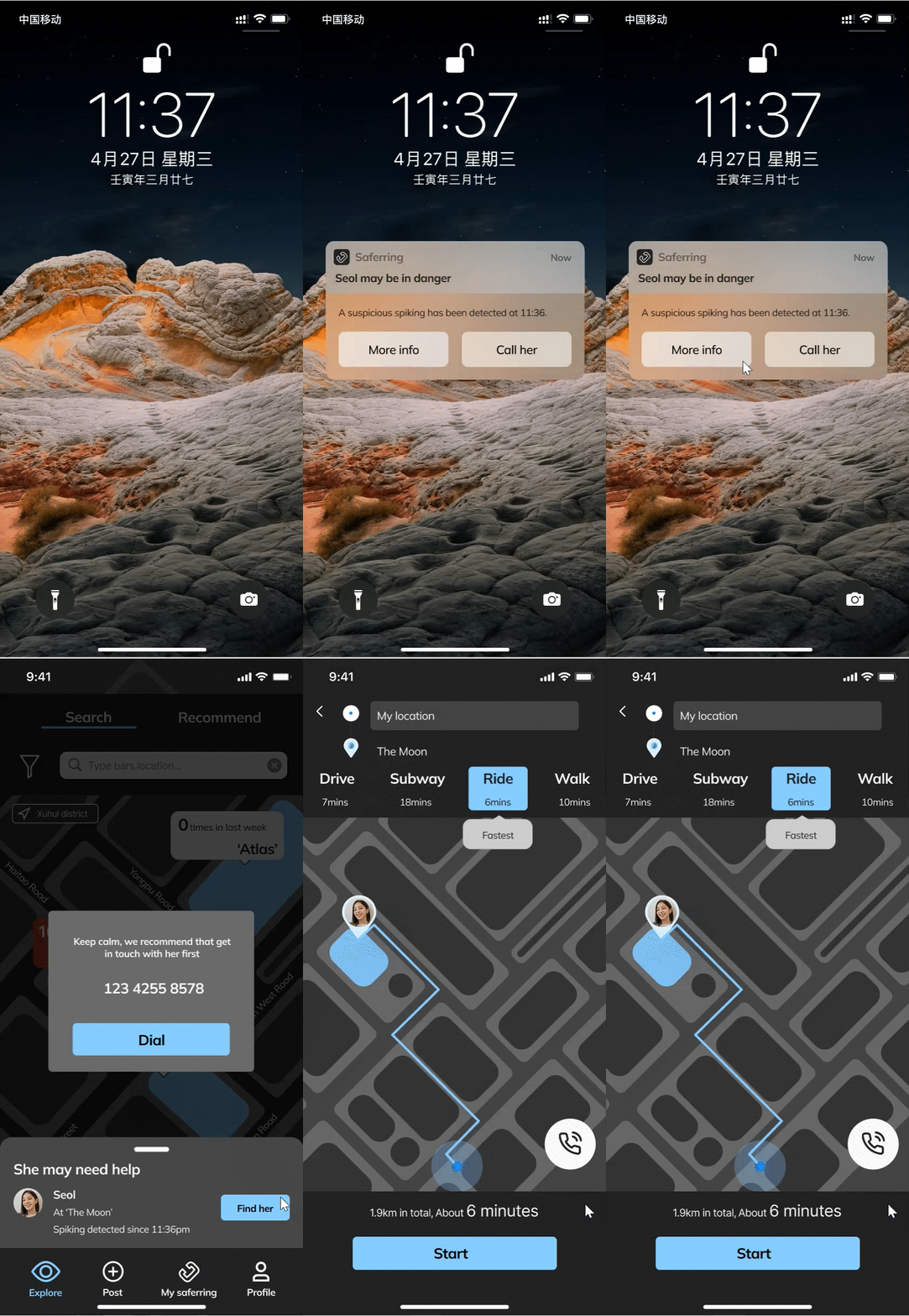
SOS received
Enable others to easily find user who is in danger.
These info will also be sent as message with continuous prompts to ensure an efficient SOS without App installment.
Fitting design challenge 3 - enable users to get noticed at once when they’re in danger
High Fidelity Prototype
Future steps
Based on usability testing feedback and user interview, there are several more directions that I will carry on to provide a more comprehensive protection and better user experience.
More lightweight
To better adapt to different cups or occasions, such as this lightweight form that clips directly to user’s cup.
Jewelry
Considering that the main users are women, a protective jewelry might be more attractive and easier to provide more comprehensive protection for users.
For example, "a brooch that can automatically send SOS if it is pressed for 3 seconds".


